
| Goal | Build a dashboard to track and shortlist used Model 3 inventory, to inform my own EV purchase |
|---|---|
| Role | End-to-end analytics engineer |
| Tools & techniques | R, Google Sheets, GitHub Actions, Tableau Public; API extraction, scheduled refresh, dashboard build |
| Data | Tesla inventory API, the feed behind tesla.com used inventory |
| Links | Code · Dashboard |
Context
The lease on my car, a Renault Zoe EV, was coming to an end, and it was time for me to look at purchasing a new EV. At around the same time in 2023, used Tesla prices were falling sharply, so I started looking at the Model 3.
As I started searching, something about Tesla’s pricing didn’t make sense to me. There were cars with high mileage that were more expensive than similar-spec, lower-mileage options. I couldn’t get a handle on which options would offer the best value for money without pulling some data together.
When I found that Tesla’s entire inventory was freely available through an API, my car search turned into a data project.
Approach
The real challenge here was not the analysis but the plumbing. I wanted a dashboard that stayed current on its own, but I was publishing to Tableau Public, whose free tier offers no scheduled data refresh; normally you re-import the data and republish by hand.
My workaround was to use a Google Sheet as a bridge. An R script pulled the latest inventory from the Tesla API, cleaned and reshaped it, and wrote the result to a Google Sheet, authenticating through a Google Cloud service account. GitHub Actions ran that script on a daily schedule, and Tableau Public, which does refresh a Google Sheets connection automatically, picked up the changes. The result was a dashboard that updated itself every day with no manual step.
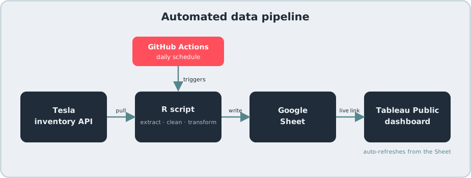
Working this out took enough effort that I turned it into a reusable, open-source project in its own right, with a step-by-step wiki, so the same pattern can drive any Tableau Public dashboard: see the tableau-public-autorefresh repository and its wiki.
The tool
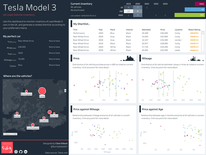
The finished dashboard presented every used Model 3 listed on Tesla.com at the time, with the final daily refresh on 19 June 2023. It mapped each car’s location and plotted the relationships between price, mileage and age, so outliers were easy to spot. A shortlist feature let the user set their own limits on budget, mileage and age and see, at a glance, how many cars in stock met them.
Findings
The dashboard turned a sprawling used-car market into something I could interrogate at a glance. Plotting price against mileage and age made the depreciation trade-offs explicit, and mapping the listings showed how the available stock was spread across the country.
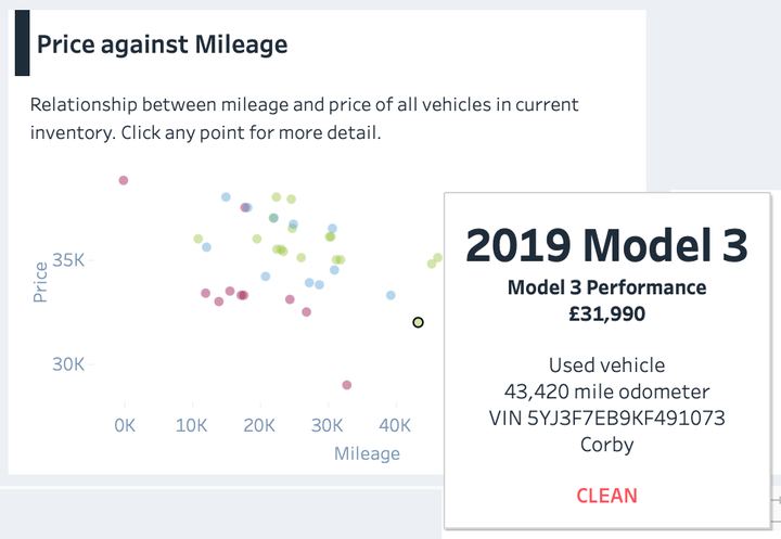
The Price against Mileage chart showed me the general trend of higher mileage/lower price, as expected. By showing the three different trim levels in different colours, I could also see that higher trim levels did generally command a higher price. However, it was the outliers that I was really interested in; the vehicles at the lower end of the price range for a given mileage. This was much easier to spot through a chart than by trawling through the listings.
The My Shortlist feature was useful to narrow down my preferences with regard to trim, age, price etc. The Match Rating allowed me to see how many of my criteria were met in each vehicle, and provided a neat way to rank the shortlist.
The analysis did its job: I identified the best value options for my preferred criteria. Ultimately, though, I chose a different brand for reasons beyond the data, a reminder that even a good analysis is only one input to a decision.
Limitations and next steps
Because the pipeline captured a daily snapshot rather than a history, it could show the market on a given day but not how any individual car’s price moved over time; persisting each day’s pull into a historical table would be the natural next step. The pipeline also leaned on Tesla’s unofficial inventory API, which came with no guarantee of stability. I have since stopped the feed because maintaining it against frequent changes to the underlying structure of the API was too burdensome, which is why the dashboard now shows a fixed snapshot rather than live data. Extending the same auto-refresh pattern to other models, or adding price-history tracking, would be the obvious ways to take the project further.